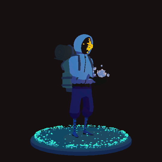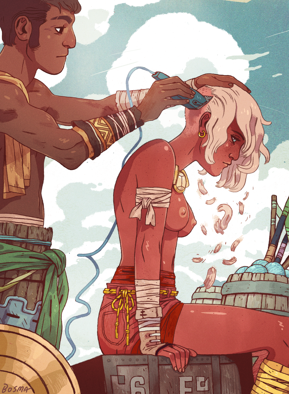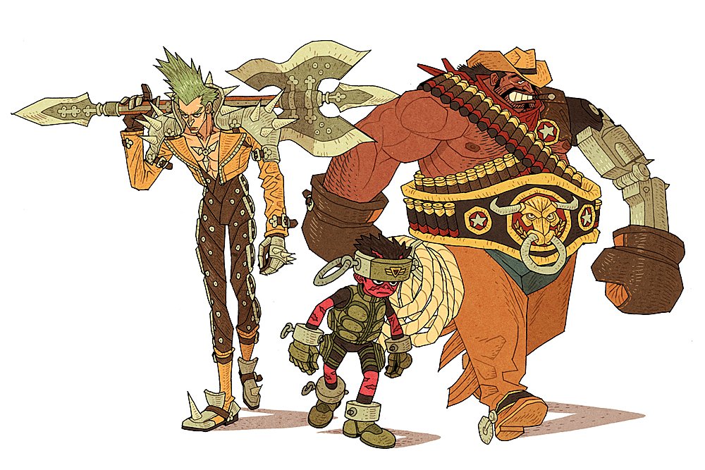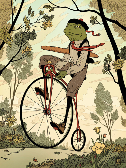
I’ve been asked a few times recently to share my process for designing characters! I think it’s a fairly weird and not quite optimal process, but I’m gonna share it anyway and someone might learn a thing!
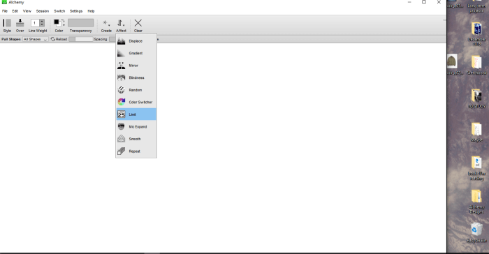
Alright first things first, you’re gonna need some type of image manipulation program. I use Photoshop CS6. The version doesn’t really matter. It’s really rad for changing colors and it does pretty much all the stuff I need. Second things second, go over here http://al.chemy.org/download/ and download this really rad program called Alchemy.
Alchemy was intiated by Karl D.D. Willis and Jacob Hina as a way to explore and experiment with alternative ways of drawing. There are a lot of weird tools and settings that you can play around with in this program to make different sorts of designs that your otherwise conscious stupid human brain might not immediately think of.
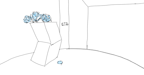
I like to put the “Create” setting under pull shapes, which picks shapes randomly from folders in Alchemy and then places them onto the canvas rotated and resized randomly. I also click the “Affect” setting tab and set it to limit the number of shapes that can be on screen before it begins removing them. This is good setting because too many shapes and your screen quickly becomes an indecipherable mess.

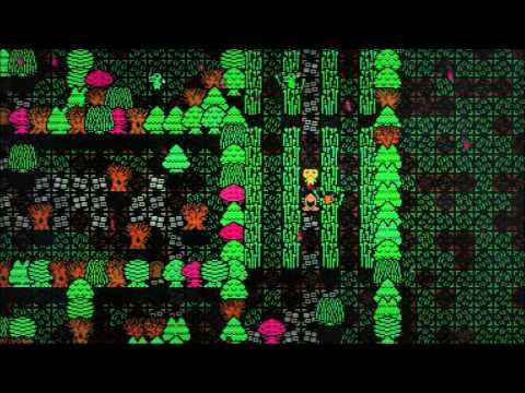
START PUTTING SOME SHAPES DOWN.

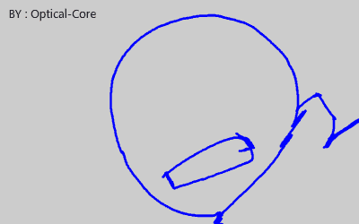
You’re gonna make a bunch of crap for awhile, but every now and then you’re gonna come across some combination of shapes that speaks to the ghoul inside your brain that says “Hey this is actually pretty interesting”. When the ghoul says that, that’s your cue to export that combination of shapes to .PNG or some other file that you’d like to manipulate.
What I tend to look for are combinations of shapes that
A. Fit together in a way that looks like you might be able to explain why they are fitting together that way( E.g. oh maybe that is their arm connecting to their torso, oh maybe that is is a sheath on their back, oh that could be a mask or helmet they are wearing)
B. Almost balance if they were to be placed on a flat plane (if your character flys around this isn’t as important, but for us folks with legs we gotta figure out a way to balance our weight on our appendages)
C. Are interesting in their juxtaposition with each other.( Big stuff near small stuff, long stuff near short stuff, curved lines near straight lines, organic looking shapes near mechanical looking shapes).
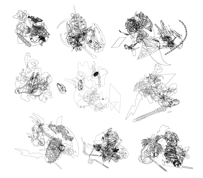
“OK” designs
Make a bunch of these darn things(Like 30 or 40) and put them in a folder called “OK” no matter how cool you think they are at the time that you make them. (this is actually a really important step). I like to give these things weird file names that might spark my imagination if I decide to actually go further with them. Some notable examples:
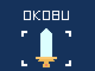
Unknown Death Shaman, Cloaked Metaphysical Knight, Abandoned Waiting, Windswept Peacekeeper, Haunted Arm.
These names don’t really need to mean anything, they are just things to keep your brain all juiced up if you decide to use them.
Alright so then after you do that go get a cup of coffee or something and try not to think about the things you just made. COME BACK TO IT WITH FRESH EYES. Go through your “OK” folder one by one with a critical eye and move the best designs to a folder called “GOOD”. Try to do this as quickly as possible. If a design does not immediately inspire you right away cast it away like the GARBAGE THAT IT IS and move on. Don’t get sentimental about things that you think could “maybe perhaps work if I just spent a bunch of time moving stuff around”. YOU DON’T HAVE TIME FOR THAT STUFF.

“GOOD” folder
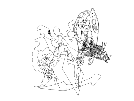
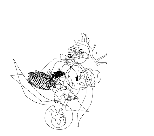
After that go through your folder called “GOOD” as quickly as possible and move the best ones from there to a folder called “VERY GOOD”. Be relentless with this process. Hopefully only 4 or 5 end up making it to the “VERY GOOD” folder.

“VERY GOOD” folder
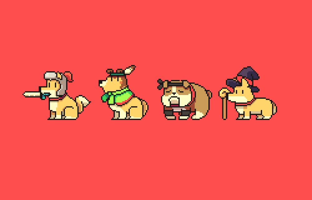
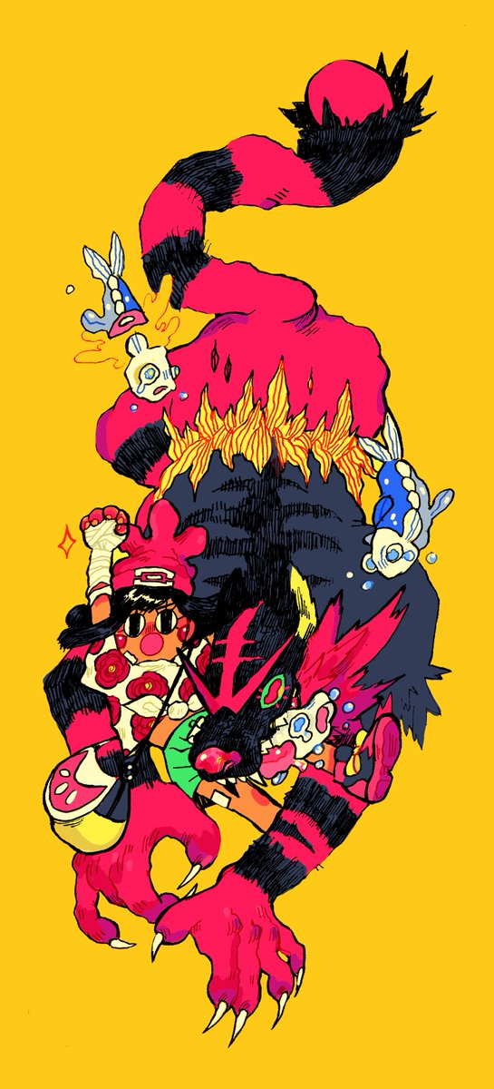
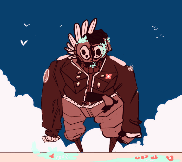
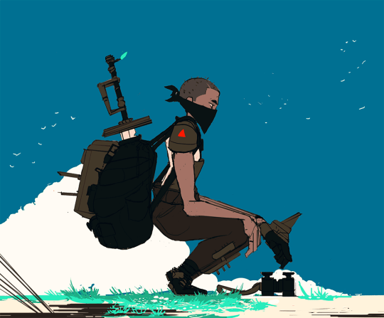
Once I got a few in the “VERY GOOD” folder that I’m excited to work on I drag ’em into photoshop and upscale the image size to like 8000 px at 300DPI because I’m eventually gonna put all these into a book so I need them to be big enough to print.
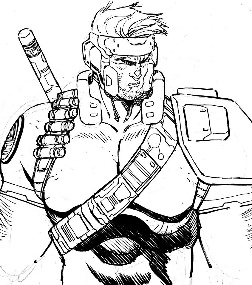
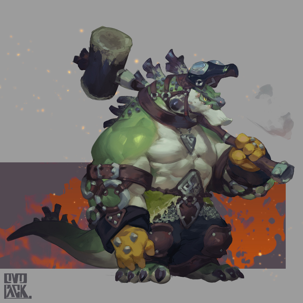
From there I carve away at the lines with the eraser and try to logically reason what certain forms could possibly signify. DESIGN IS COMMUNICATION. I want to communicate certain things about the world that this character exists in to the player immediately. What species are they? What materials are available to these characters? What kind of clothing do they wear? How does “Tower culture” dictate what they might find fashionable or practical (Are they a character who is even aware of these things?) . Interpret these abstract shapes with these questions in mind! And feel free to completely subtract parts you don’t like. Don’t be tied to the original shape formation completely.
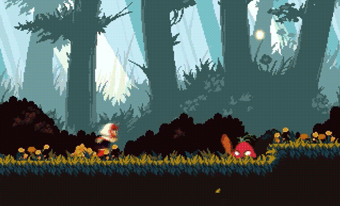
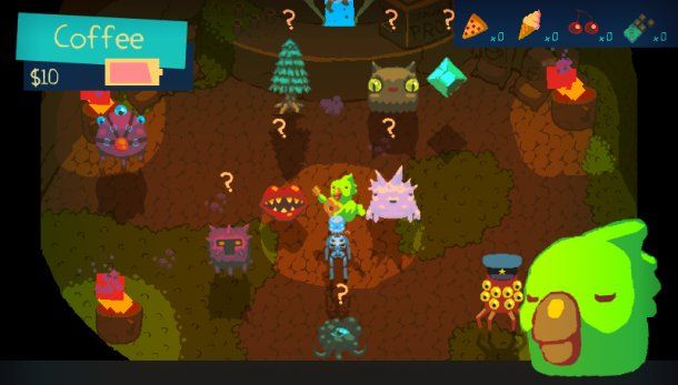
Then I make a new layer on top of the lineart and set the blend mode to “Multiply. I pick like 4 or 5 values fairly far apart from one another and fill these shapes in a way that clearly separates them from one another. I do this because I’m eventually going to recreate these designs with pixel art so I need to keep them fairly simple and readable!
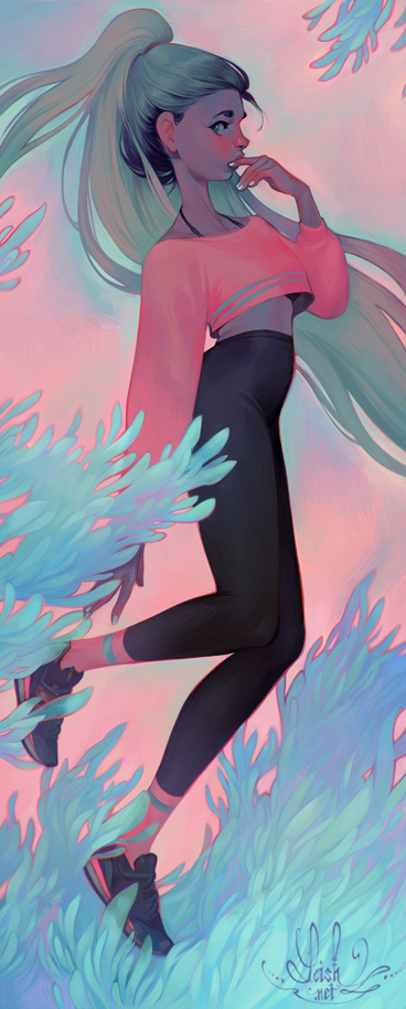
That’s it basically! Coloring these is probably another tutorial entirely. I don’t have a very optimal process for that part. I usually just make a bunch of “Gradient Map” layers and set them to different blend modes and adjust sliders for minutes upon minutes and try to remember an ounce of color theory.

Whelp that’s about it! I hope this helped! Go out and make a bunch of cool characters really quickly ! Also feel free to share character design tips in the comments. HOW DO YOU DO IT?